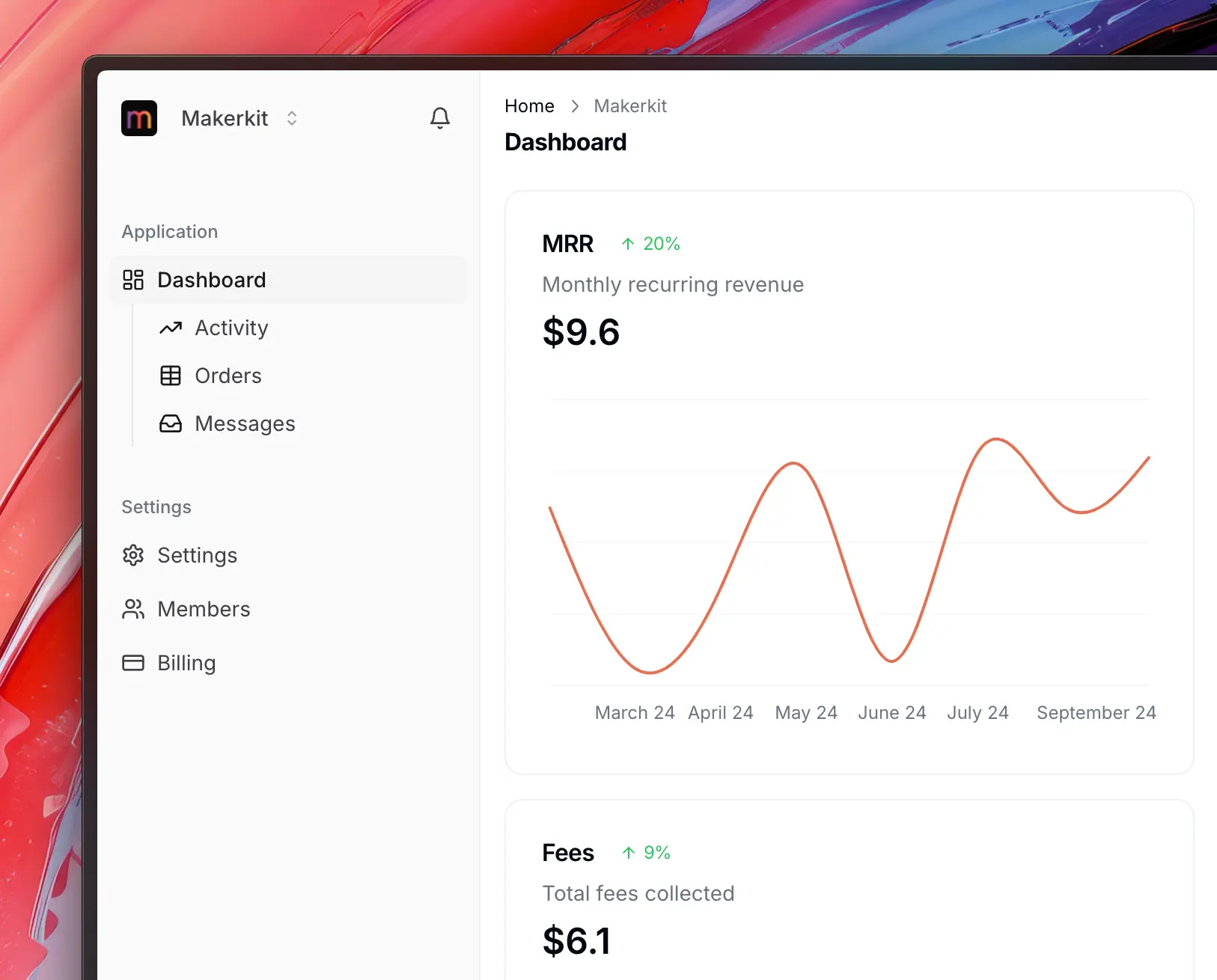
Shadcn UI has recently released a new, powerful Sidebar component. This component is a more modern and polished design, and it allows you to compose your sidebar for a much more powerful experience.
The latest version of Makerkit also uses the new Shadcn Sidebar (with some modifications). In this post, we go through the changes that we made nad how you can leverage an customize the Sidebar behavior.
How does it look?
Well, it does look good. You can judge for yourself:
Multi-level Sidebar
The new sidebar allows you to create a multi-level sidebar, which is a great feature for larger applications.
 Click to expand
Normal Sidebar
Here is the normal sidebar, which is the default one.
 Click to expand
Dark Mode
The same sidebar, but in dark mode.
 Click to expand
Minimized Sidebar
Here is the minimized sidebar:
 Click to expand
You can configure the sidebar to be minimized by setting the sidebarCollapsed property to true in the navigation.config.tsx file.
Additionally, you can configure to expand on hover.
What are the changes required in Makerkit?
The only change needed is to create a group for your routes that were previously ungrouped.
To do so, move from the old data structure to the new one:
The old data structure allowed flat routes, while the new one requires routes to be grouped.
const routes = [ { label: 'common:routes.dashboard', path: pathsConfig.app.accountHome.replace('[account]', account), Icon: <LayoutDashboard className={iconClasses} />, end: true, }, { label: 'Support Tickets', collapsible: false, path: `/home/${account}/tickets`, Icon: <MessageCircle className={iconClasses} />, }];The new data structure requires routes to be grouped, so we need to add a group for the support tickets route.
As you can see, we added a children property to the route object, which is an array of routes that will be grouped under the parent route.
const routes = [{ label: 'common:routes.application', children: [ { label: 'common:routes.dashboard', path: pathsConfig.app.accountHome.replace('[account]', account), Icon: <LayoutDashboard className={iconClasses} />, end: true, }, { label: 'Support Tickets', collapsible: false, path: `/home/${account}/tickets`, Icon: <MessageCircle className={iconClasses} />, }, ], }]Settings
You can configure the sidebar settings using environment variables:
To set the Sidebar (user workspace) to be minimized, you can use the following environment variable:
NEXT_PUBLIC_HOME_SIDEBAR_COLLAPSED=trueAnd to set the Sidebar (team workspace) to be minimized, you can use the following environment variable:
NEXT_PUBLIC_TEAM_SIDEBAR_COLLAPSED=trueNext Steps
In the future, we will allow the ability to fully collapse the sidebar using a button (similar to Stripe).
I hope you'll enjoy using the new Shadcn Sidebar in Makerkit!